Damask Woven Labels Explained: Materials, Design and Production Tips
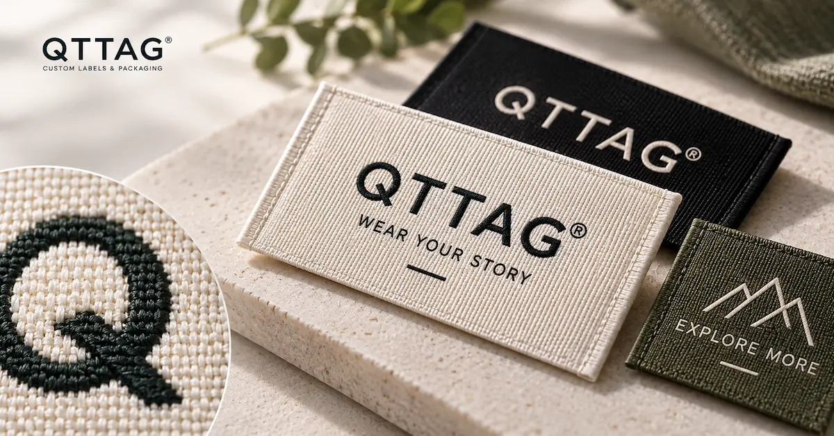
A detailed logo can look impressive on a computer screen. Translating that same design into a small woven label is a different challenge.
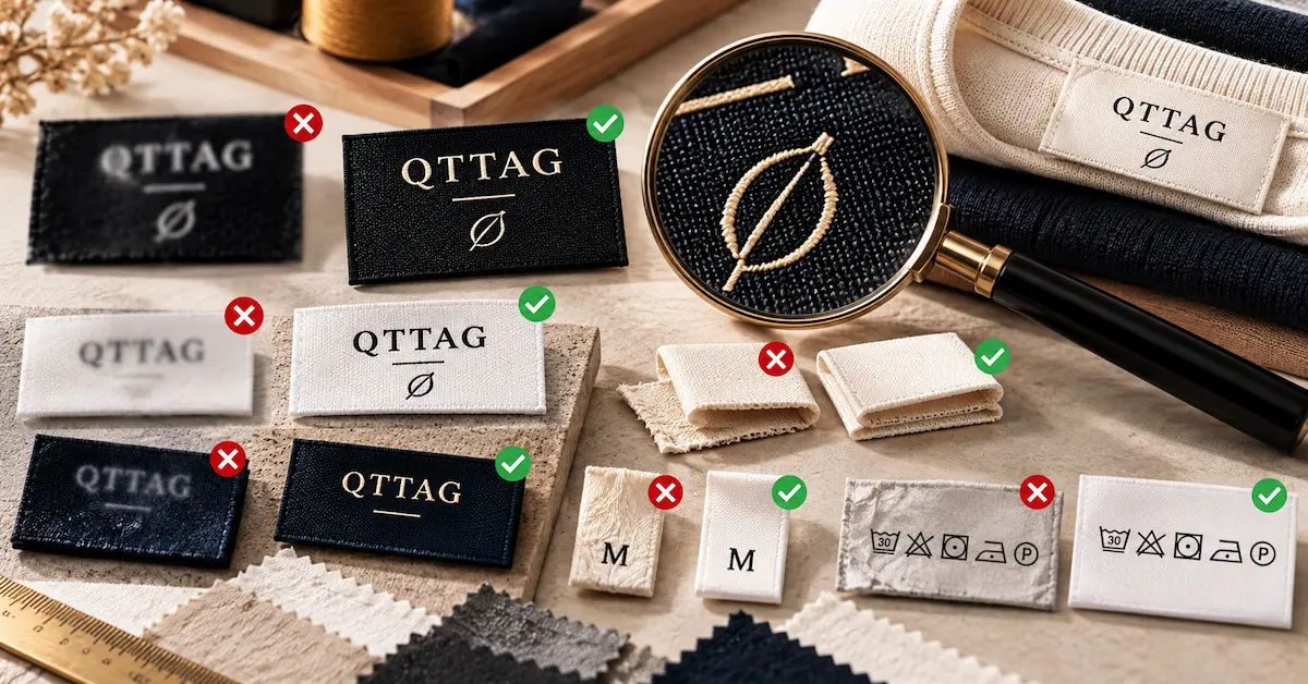
A brand might have an elegant wordmark with thin lettering, a circular emblem, or a symbol containing several narrow lines. When the design is reduced to a 40 mm clothing label, some details may become difficult to recognize.
This is one reason apparel brands consider damask woven labels. They are commonly selected for branding projects where a refined woven appearance and clear design reproduction matter.
But the term damask alone does not tell a buyer how sharp the lettering will be, how soft the label will feel, or whether the design can be manufactured at the requested size.
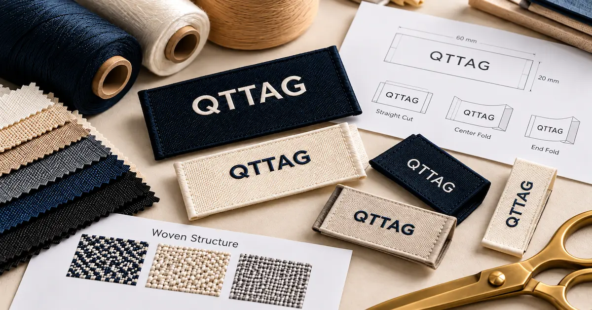
Damask woven labels are woven textile labels that use a damask-style construction to create logos, text, and decorative patterns. Their appearance depends on the yarns, weave structure, pattern resolution, dimensions, and finishing.
For buyers, the important question is whether the selected construction can reproduce the approved artwork clearly while remaining suitable for the garment.
This guide explains how to evaluate damask woven labels from a design and quality perspective, including practical ways to assess fine lettering, logo definition, surface texture, and finished-label performance.
What Makes Damask Woven Labels Different?
Damask woven labels are commonly associated with refined textile graphics and a comparatively detailed woven appearance.
Unlike printed labels, where graphics are applied to an existing material, the visible design is formed through yarn interlacing.
In apparel-label manufacturing, suppliers may use the word damask to describe particular constructions and levels of graphic detail. The exact terminology can differ between factories.
That distinction matters.
Two manufacturers may both offer damask labels, yet their samples can differ in surface texture, visible yarn structure, edge definition, and lettering clarity.
The name of the construction is therefore not enough to establish a quality standard.
What Buyers Should Evaluate
A suitable damask label should be assessed for:
-
Readability of the brand name
-
Clarity of important logo details
-
Uniformity of the woven surface
-
Separation between design colors
-
Consistent dimensions
-
Appropriate flexibility and comfort
-
Suitable edge and fold finishing
These characteristics should be reviewed against the artwork, garment application, and agreed manufacturing specification.
Damask Labels at a Glance
| Feature | What It Means for Buyers |
|---|---|
| Woven Artwork | Logo and lettering formed through yarn construction |
| Detail Reproduction | Depends on yarn size, loom setup, pattern and label dimensions |
| Surface Texture | Varies according to weave and finishing |
| Color Appearance | Influenced by yarn colors and their arrangement |
| Comfort | Depends on material, thickness, folds and edges |
| Durability | Requires evaluation under relevant use conditions |
| Customization | Artwork, colors, dimensions and finishing may be specified |
A premium description should never replace physical evaluation.
How Much Logo Detail Can a Damask Label Reproduce?
This is often the most useful question to ask before ordering.
A digital logo may contain very fine details, but woven reproduction operates within the physical limits of yarns and the weaving pattern.
The smaller the finished label, the less space is available for reproducing complicated shapes.
Fine Lettering
Consider a logo containing a short brand name and a thin subtitle underneath.
The main name may remain readable while the subtitle loses clarity.
Making the subtitle slightly larger, increasing spacing, or using an approved simplified design can improve the result.
There is no universal minimum text size that guarantees successful reproduction on every damask label.
The achievable detail must be confirmed through the proposed construction and physical samples.
Curved Logos
Curved elements can be particularly sensitive to the available woven pattern resolution.
A smooth vector curve is represented physically through yarn arrangements.
Depending on the construction, its edge may appear less continuous than the digital version.
The effect becomes more noticeable at small sizes.
Narrow Gaps
A logo containing several lines close together may lose visual separation.
If two features become difficult to distinguish, the design may need more spacing or a larger finished label.
Small Symbols
A detailed symbol may work well at a larger size but become visually crowded when reduced.
The goal is to preserve the most recognizable features.
Buyer tip: Evaluate the woven label at its actual size. Enlarged product photographs can make tiny lettering appear more legible than it will be on the finished garment.
Damask Woven Label Design: What Should Be Simplified?
Not every logo needs modification.
Simple artwork with clear lettering and strong contrast may already suit the intended label construction.
More detailed graphics benefit from a feasibility review.
Common Design Challenges
| Design Feature | Possible Problem | Practical Recommendation |
|---|---|---|
| Very Thin Text | Letters lose definition | Review weight and size |
| Small Tagline | Difficult to read | Enlarge or omit if optional |
| Narrow Letter Spacing | Characters visually merge | Increase spacing with approval |
| Fine Circular Lines | Uneven visual edges | Review artwork dimensions |
| Complex Illustration | Important features disappear | Consider simplified artwork |
| Closely Related Colors | Weak contrast | Review the yarn color combination |
| Detailed Gradient | Difficult to reproduce as a smooth transition | Consider an alternative graphic treatment |
These are possible adjustments, not automatic design rules.
The manufacturer should explain which details may be difficult to reproduce, and the brand owner should approve any change to the artwork.
Preserve the Original Brand Identity
Some suppliers may offer to redraw a logo to make weaving easier.
That can be useful when the buyer agrees to the changes.
However, the final design should remain consistent with the approved brand identity.
Changing letter proportions, distorting a symbol, or modifying spacing without approval can introduce brand inconsistencies.
For brands with strict visual guidelines, supply a master logo file and identify which features must not be changed.
Does Higher Weaving Density Always Mean Better Detail?
Buyers often associate a higher weaving density with better quality.
Density can influence the amount of woven detail available within a given area, but it is only one part of the result.
Yarn thickness, weave structure, equipment capabilities, pattern preparation, and label dimensions also matter.
A high-density construction cannot automatically correct an unsuitable design.
An Example of the Trade-Off
Imagine two logos.
The first contains a bold wordmark with generous spacing.
The second contains an intricate emblem and a small line of text.
The first design may reproduce clearly without requiring the most demanding available construction.
The second may need additional design space or a different technical approach.
The better choice depends on the artwork and finished label requirements.
Ask for Meaningful Comparisons
If a supplier offers several construction options, request comparable samples using:
-
The same artwork
-
The same finished dimensions
-
The same target colors
-
Comparable edge and fold finishing
Then examine the differences.
A useful comparison should focus on results rather than simply choosing the option described as higher density.
What Should Be Compared?
| Quality Indicator | Why It Matters |
|---|---|
| Small Text Clarity | Shows whether fine lettering is usable |
| Logo Edge Definition | Helps assess curves and diagonal elements |
| Surface Uniformity | Reveals unwanted variation in the woven appearance |
| Color Separation | Helps determine whether design elements remain distinct |
| Thickness | Affects finished construction and comfort |
| Flexibility | Influences garment compatibility |
The best damask label is not necessarily the one with the highest stated density. It is the one that meets the approved design and garment requirements.
Damask vs Satin vs Taffeta: What Is the Real Difference?
These names frequently appear in clothing-label catalogs, but comparisons can be confusing.
Damask, satin and taffeta are terms associated with textile constructions or surface characteristics. In commercial label catalogs, their usage is not always strictly standardized.
They should not automatically be treated as mutually exclusive material categories.
For example, the yarn composition is a separate question from the weave construction.
A buyer should therefore ask for both the material specification and the actual woven construction.
Practical Buying Comparison
| Label Description | Common Buying Interest | Important Verification |
|---|---|---|
| Damask Woven Label | Refined logo reproduction and textile appearance | Actual detail, surface and construction |
| Satin Label | Smooth or lustrous finish | Weave, yarn composition and hand feel |
| Taffeta Label | Defined textile structure | Texture, stiffness and application suitability |
| High-Density Woven Label | Potentially finer woven detail | Density specification and physical results |
The table describes typical purchasing considerations, not fixed performance rankings.
A label described as damask is not automatically softer than another label, and a satin label is not automatically less durable.
Both claims would require an appropriate technical comparison.
How Should Buyers Decide?
Start with the intended garment and artwork.
If small lettering is the main concern, compare clarity at actual size.
If comfort is the priority, evaluate the finished label against the skin.
If the label will be externally visible, assess how its texture and visual finish complement the clothing.
The sample should determine the decision, not the category name alone.
Which Apparel Products Are Suitable for Damask Labels?
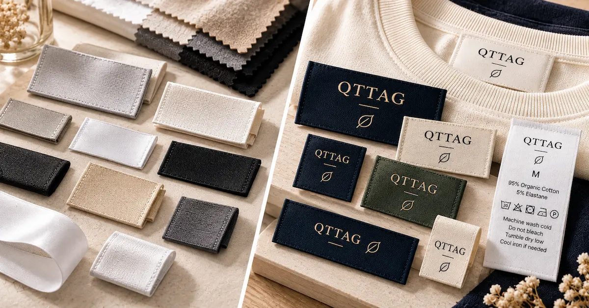
Damask woven labels can be considered for a range of apparel and textile products, provided the proposed construction suits the application.
Premium Fashion and Designer Apparel
Designer collections may use damask labels to present a detailed wordmark or graphic emblem.
In these applications, consistency of the woven artwork can be important.
However, an intricate label does not necessarily improve the garment's visual identity.
Some premium brands are better represented by simple lettering and restrained design.
Knitwear
Knitwear can benefit from a carefully selected woven brand label.
The buyer should assess how the label behaves against the knitted material.
A label that is too stiff or heavy may not complement a lightweight knit.
Jackets and Outerwear
Jackets may allow more space for detailed branding.
An interior label can sometimes accommodate larger dimensions than a compact T-shirt neckline.
This can provide additional room for complex artwork.
Bags and Accessories
Woven labels may be used on fabric bags and other textile accessories.
The required edge finish and attachment method should match the product.
Application Decision Table
| Product | Branding Priority | Main Technical Check |
|---|---|---|
| Premium T-shirt | Clear logo and comfort | Size, edges and softness |
| Knitwear | Refined appearance | Flexibility and attachment |
| Designer Jacket | Detailed branding | Artwork clarity and dimensions |
| Denim | Distinctive identity | Surface finish and durability |
| Fabric Bag | Visible brand identification | Attachment and abrasion exposure |
| Fashion Accessories | Compact branding | Detail at small dimensions |
A label should be assessed on the actual product whenever the application affects comfort or attachment.
Why Physical Texture Matters in Damask Woven Labels
Photographs can show a label's general appearance, but they do not fully communicate texture.
Two visually similar labels can feel different when touched.
One may be relatively flexible, while another feels more structured.
Differences in yarns, weaving construction, finishing, and label thickness can influence the result.
Surface Feel
For clothing labels positioned against the skin, check whether the woven surface feels comfortable.
Do not assume that a visually refined surface is automatically soft.
Backside Texture
The reverse side may have a different appearance and texture from the visible face.
Depending on the woven construction, the reverse can contain yarn arrangements that affect its physical feel.
Ask to inspect both sides when the reverse may contact the garment or skin.
Fold Thickness
A label may feel flexible before folding but become noticeably thicker where multiple layers overlap.
This is particularly important when the folded area is sewn into a narrow garment seam.
Edge Comfort
The edge finish can matter as much as the woven surface.
A label may have a smooth face but uncomfortable cut ends.
Evaluate the completed label, including its folding and intended attachment.
How to Evaluate the Quality of a Damask Woven Label
Quality should be judged against an agreed specification.
A buyer should not rely only on whether the label looks attractive.
Step 1: Inspect the Logo
Compare the woven design with the approved artwork.
Look at lettering, symbol geometry, important spacing, and overall proportions.
Step 2: Examine Fine Details
Inspect the smallest important design features.
Check whether letters remain distinct and whether lines appear separated.
Step 3: Review Surface Consistency
Look for visible irregularities, unintended yarn effects, or other defects that fall outside the agreed quality requirements.
Step 4: Check Dimensions
Confirm the finished width and height.
If the label is folded, measure it according to the approved finished-size specification.
Step 5: Check Color Appearance
Compare the actual label with approved color references under appropriate lighting.
Step 6: Evaluate the Finished Application
Attach the label to a representative garment when comfort, visibility or fit is important.
Damask Label Inspection Checklist
| Inspection Item | What to Examine | Acceptance Basis |
|---|---|---|
| Logo Accuracy | Shape and proportion | Approved artwork |
| Fine Text | Readability | Approved sample |
| Graphic Edges | Important contours | Approved sample |
| Color | Yarn appearance and contrast | Agreed reference |
| Surface | Visible defects and consistency | Agreed quality criteria |
| Dimensions | Finished width and height | Technical specification |
| Edges | Cutting and finishing | Approved sample |
| Comfort | Feel against intended garment | Application requirements |
| Attachment | Sewing compatibility | Garment specifications |
Acceptable tolerances and inspection methods should be agreed upon before bulk production.
How to Compare Damask Label Samples from Different Suppliers
Comparing samples can be difficult when each supplier uses different dimensions, artwork adjustments, or finishing methods.
A fair comparison requires a shared reference.
Use the Same Artwork
If one supplier simplifies the logo and another reproduces the original version, the resulting labels are not directly comparable.
Use the approved design or document every proposed adjustment.
Keep Dimensions Consistent
A larger sample may reproduce fine details more clearly simply because it provides more space.
If the buyer wants to compare manufacturing capability, request the same target dimensions.
Compare Finished Samples
One supplier may provide a loose woven piece while another provides a cut and folded label.
These products are not at the same finishing stage.
Ask suppliers to quote and sample comparable constructions.
Consider Total Suitability
Do not compare only graphic detail.
Also evaluate comfort, finished size, fold accuracy, color, edge quality, and relevant production requirements.
A highly detailed label is not useful if it does not fit the intended garment.
Supplier Sample Comparison Sheet
| Evaluation Factor | Supplier A | Supplier B |
|---|---|---|
| Logo Clarity | Record findings | Record findings |
| Small Text Readability | Record findings | Record findings |
| Surface Consistency | Record findings | Record findings |
| Finished Dimensions | Record findings | Record findings |
| Comfort | Record findings | Record findings |
| Edge Finish | Record findings | Record findings |
| Color Match | Record findings | Record findings |
| Overall Suitability | Record findings | Record findings |
Do not assign a supplier a higher score simply because the product description includes the word premium.
Base decisions on the actual sample and the agreed requirements.
Common Damask Label Problems and How to Identify Their Causes
Some defects are related to artwork. Others are related to construction, finishing or application.
Identifying the cause is more useful than automatically rejecting an entire label category.
Problem: Tiny Letters Are Unreadable
Possible reasons include limited available detail, narrow spacing or unsuitable dimensions.
Before changing the manufacturing process, review the artwork at actual size.
Problem: Curved Edges Look Uneven
Woven construction can create visible limitations in reproducing fine curves.
The buyer should evaluate whether the result meets the approved design standard.
Increasing the artwork size or adjusting specific details may help.
Problem: The Label Feels Too Stiff
The cause may involve material selection, woven construction, finishing or folded thickness.
Test another physical construction rather than assuming every damask label has the same feel.
Problem: Colors Appear Different from the Digital Design
Yarn colors and fabric texture affect the final appearance.
Use physical references instead of relying only on screen previews.
Problem: The Label Is Difficult to Sew
The fold, dimensions or edge treatment may not match the intended garment construction.
Check the technical specification and placement requirements.
Problem: Surface Appearance Is Inconsistent
Inspect the defect against the approved sample and agreed acceptance criteria.
The supplier should investigate manufacturing-related deviations before deciding on corrective action.
What Affects the Cost of Damask Woven Labels?
The cost of a damask woven label depends on the complete specification.
A design with relatively simple lettering may have different development and production requirements from an intricate emblem at the same physical size.
Relevant factors can include:
-
Label dimensions
-
Yarn composition
-
Proposed weave construction
-
Required graphic detail
-
Number of colors
-
Production setup
-
Cutting and folding
-
Order quantity
-
Number of artwork variations
-
Inspection and packing requirements
A more technically demanding construction may affect the quotation, but no universal price difference applies across every supplier.
Should Buyers Always Pay More for Higher Detail?
Not necessarily.
If the brand uses a simple logo, a construction providing additional detail may not create a meaningful visual benefit.
Buyers should compare samples and ask whether the proposed specification is necessary for the artwork.
Spending more is justified only when the additional requirement contributes to the intended product result.
Ask for Comparable Quotations
A quotation should identify whether sampling, cutting, folding, inspection and packing are included.
MOQ and lead time should also be confirmed for the specific order.
Avoid assuming that a general price published for woven labels applies to every damask construction.
What to Include in a Damask Woven Label RFQ
A useful RFQ should allow a manufacturer to evaluate both the artwork and its intended application.
RFQ Checklist
| Requirement | Details to Provide |
|---|---|
| Logo Artwork | Approved brand file |
| Finished Label Size | Width and height |
| Garment Application | Neckline, jacket, bag, etc. |
| Important Fine Details | Text, lines or symbols requiring clarity |
| Colors | Approved references |
| Material Preference | Yarn or tactile requirements |
| Proposed Construction | Damask-style sample or reference |
| Fold and Edge Finish | Requested finished format |
| Comfort Requirement | Whether the label contacts skin |
| Quantity | Estimated pieces per design |
| Quality Requirements | Relevant visual and physical criteria |
| Delivery Destination | Country or receiving location |
If design detail is a major concern, identify which features cannot be simplified.
The supplier can then assess the practical reproduction options.
An approved physical sample should be used to confirm the chosen specification before bulk manufacturing.
Frequently Asked Questions About Damask Woven Labels
What are damask woven labels?
Damask woven labels are textile labels using damask-style woven construction to create branding and decorative designs. The finished appearance depends on yarns, weave setup, artwork and finishing.
Are damask woven labels suitable for detailed logos?
They can be suitable for detailed artwork, but actual reproduction depends on dimensions, yarn properties and manufacturing capabilities. A physical sample is the best way to assess the result.
Are damask labels always softer than other woven labels?
No. Softness depends on material, weave construction, thickness and finishing. The commercial label category alone does not guarantee comfort.
What is the difference between damask and satin woven labels?
These terms describe textile constructions or surface characteristics and are not always used consistently across suppliers. Buyers should compare actual material specifications and finished samples.
Can damask woven labels reproduce small lettering?
They can reproduce small lettering within the limits of the proposed design and construction. Extremely small text may need adjustments to maintain legibility.
Is high-density weaving necessary for damask labels?
Not for every design. The required construction depends on artwork complexity, physical dimensions and manufacturing capabilities.
Can damask labels be used for T-shirt necklines?
Yes, when the material, edge finish, dimensions and attachment method suit the garment. Check comfort on a representative T-shirt.
What causes uneven logo edges on woven labels?
The result may relate to physical pattern resolution, yarn characteristics, design complexity or manufacturing consistency. Compare the sample with the agreed artwork and technical specification.
How can I compare damask label samples?
Request the same artwork, dimensions and finishing requirements, then compare fine detail, color, dimensions, texture, edges and garment suitability.
What should I send for a damask woven label quotation?
Provide your artwork, dimensions, garment application, color references, desired construction, fold requirements, estimated quantity and quality expectations.
Choose Damask Woven Labels Based on Your Actual Design
A damask woven label should be selected for what it contributes to the finished garment.
For some brands, the main benefit is clearer reproduction of a detailed wordmark. Others may value the surface texture or visual character.
The right decision starts with the actual artwork.
Review its smallest important details. Confirm the intended label dimensions, and compare proposed constructions using physical samples.
Check the finished label on the garment when comfort, edge treatment or attachment is important.
QTTAG supports custom woven labels and coordinated apparel branding products. Brands can submit their artwork, specifications and preferred design references for a project-specific review.
If you are considering damask woven labels, it is useful to identify which visual details matter most before requesting a sample.
Ready to Create Custom Damask Woven Labels?
Share your logo, label dimensions, garment application, color references and estimated quantity with QTTAG. Our team can help you explore suitable damask woven label designs and sampling options.
Request a Quote → Create Your Custom Sample
Author
Founder at QTTAG
Jason Qiao is the founder of QTTAG, focusing on garment branding and packaging solutions. With years of experience in the apparel industry, he shares practical insights on custom labels, hang tags and sustainable packaging to help global brands grow.
Written By
Jason Qiao